Friday, March 15, 2013
Interim Presentation
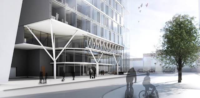
The critique I received on Tuesday included: changing my floor to ceiling heights from 2.6 to 3m, tighening up the married and barrier free units (and taking advantage of my setback so more light enters the barrier free unit). I also need to further develop my HVAC system and expand my basement level. Also, my third space needs to tie into the DMZ more. Other than that, more than half of the technical issues that Danielle posted were said during my crit (I went first), so I need to look into those.
Subscribe to:
Post Comments (Atom)

.jpg)
.jpg)
.jpg)

.jpg)


The images/drawings are hard to read at the scale you have posted them, but:
ReplyDelete-the bow truss components are light and fine in the overall aesthetic of the building but they seem to have a conflict with the structure of your truss and splayed columns at the Gould Street elevation
-please ensure you follow convention with black lines throughout the design; do not get condemned to repeat second year because you demonstrated an inability to follow first year conventions
-what are those furniture elements in the north ground floor area?; they are distracting and look out of context
-the main entry off Gould could work but the space on the ground floor is vacuous
-not sure why you have to have double height space in the storage area; could potentially look weird if you think about actually being there
-third place on the mezzanine level is unclear and it needs to be clear about its connection to the ground floor
-basement really doesn't seem to be reinforcing or optimizing to structural or design organizations
-my challenge to EVERYONE who has proposed communal spaces on residential floors to actually get out of plan and actually envision being in the space via perspectives that go beyond the furniture showroom layout
-you will have to tweak up the structure as there are some gaffes such as the DMZ level structure to the HMV wall
-the technical resolution in your sections is fine but there really still are questions about the design of the space; technical resolution is the easy part of the project - it is the strength of a design that eludes most students
-I hope for your sake that you step out of the Revit preoccupation so that you can eventually return to better methods of representation; the shaded Revit drawings will not do anyone any justice; it's like people who still use SketchUp and pretend that it makes them look like they really know how to 3D model (you know those feeble-minded, terrible "designers" who should leave the program now with pride as opposed to next year in a ball of fire)
-still not impressed with the elevations; they lack a design strength that I have been led to believe you have; now is not the time to hold back